Architecture
Library Book Nook
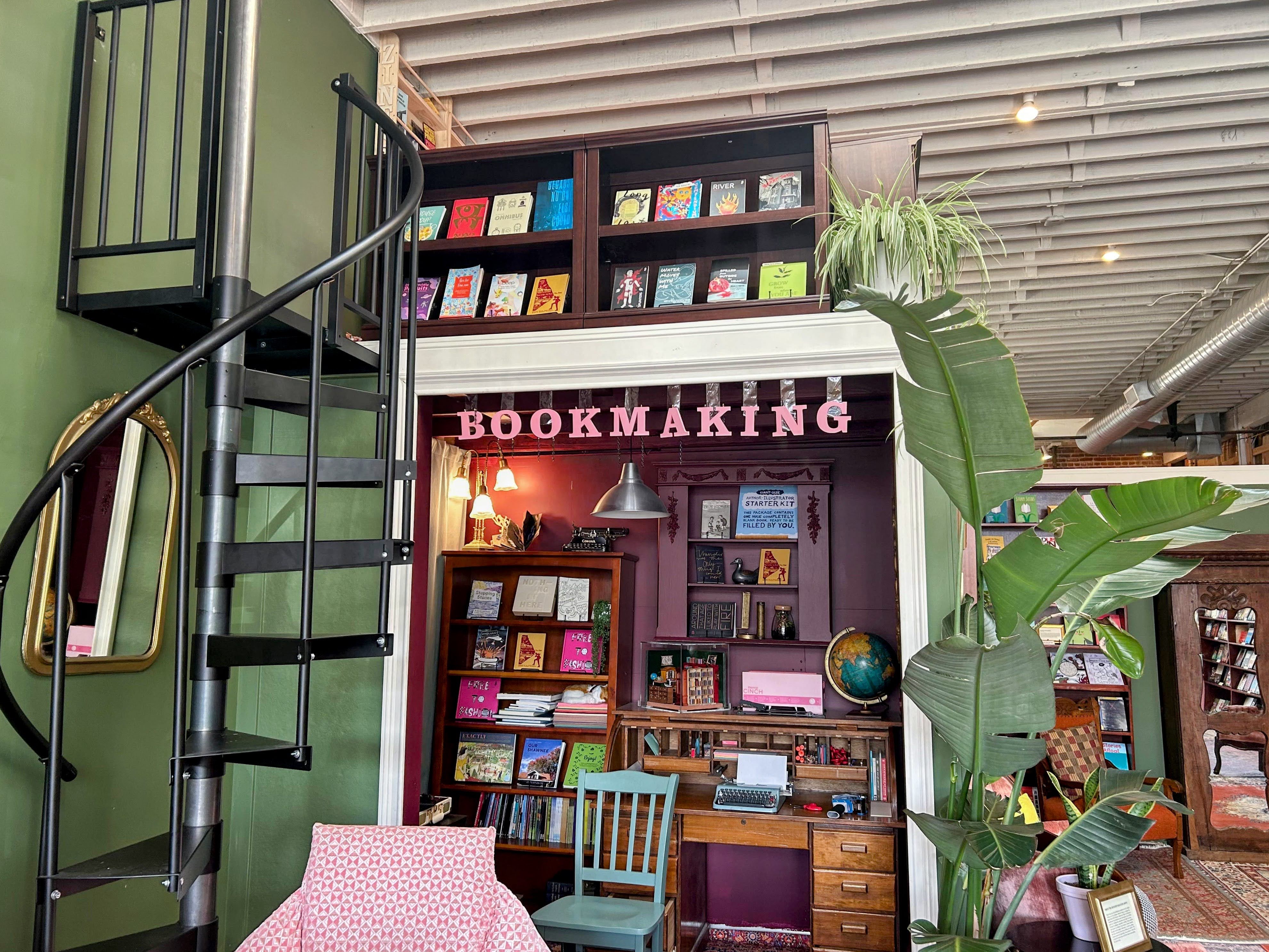
The International Library for Young Authors at 849 Valencia has a little nook space for bookmaking (binding) along with tools for making zines. The founder wanted to reimagine what the space could be:
“Because you are so creative and have a rich architectural background, I’d love it if you could really let your mind go in terms of designing that bookmaking area. Ideally we are using simple materials that we can buy, but otherwise I hope you could make it something you’re really proud of, and which uses all your talents. Spend a day or two drawing and dreaming. I know you’ll come up with something brilliant.”
I love blue sky directives, which counterintuitively also included a list of requirements underneath that I promptly ignored. I was hired as a librarian rather than an architect/interior, so I was getting pulled away, but quickly returned to establishing the catalogue and circulation systems, along with community engagement and programming. Below is an excerpt of my brief time on the project.
We have very different creative processes and ways of working, compounded by the employer/ee relationship/dynamic, so after a couple false starts on other smaller projects, where admittedly I did get carried away with the possibilities of high quality wood, I shared:![]()
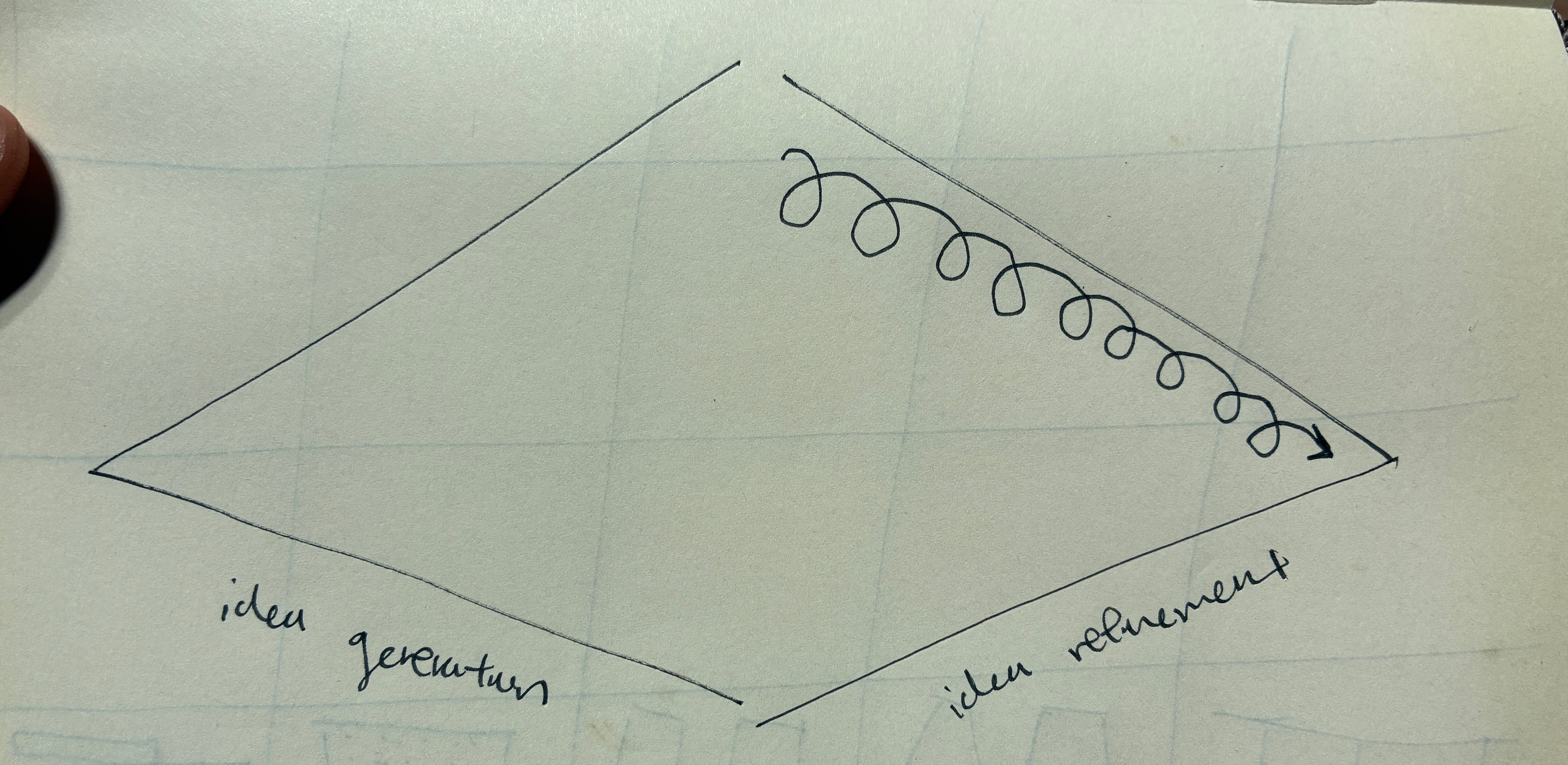
This diagram was just to show my preferred way of working on these types of projects. The first phase is free form idea generation meaning going from a prompt and generating any and all ideas. The second phase selects among the most promising ideas and then iterates with feedback in a direction that gets to the ultimate solution.
I figured I'd share what I already had and you can pick/choose/modify/leave it.That said, these are concepts/ideas that taken at face value are probably not at all feasible with the restraints provided but I think there could be salvageable gems to implement.
I figured I'd share what I already had and you can pick/choose/modify/leave it.That said, these are concepts/ideas that taken at face value are probably not at all feasible with the restraints provided but I think there could be salvageable gems to implement.
Garage (Band, Startup, etc.)
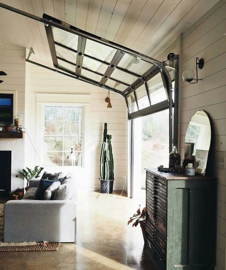
The first concept is inspired by Max's Garage in East Bay and my own enjoyment of transparent garage doors like the one here. It's a solution to somewhat claim slightly more space for the book nook. So imagine the curtain/end of the nook is where the left garage door hinges are, and the rest of the space is claimed by the outward closing door. This also offers flexibility in how to use the space since the door can be left open most of the time until dedicated bookmaking needs to happen. Again, I know this doesn't match the aesthetic of the space but I didn't really think the black metal staircase did either, and this would match that. We could probably make a much cheaper, faux simile with a pulley system.
The first concept is inspired by Max's Garage in East Bay and my own enjoyment of transparent garage doors like the one here. It's a solution to somewhat claim slightly more space for the book nook. So imagine the curtain/end of the nook is where the left garage door hinges are, and the rest of the space is claimed by the outward closing door. This also offers flexibility in how to use the space since the door can be left open most of the time until dedicated bookmaking needs to happen. Again, I know this doesn't match the aesthetic of the space but I didn't really think the black metal staircase did either, and this would match that. We could probably make a much cheaper, faux simile with a pulley system.
The Right Tool at the Right Time
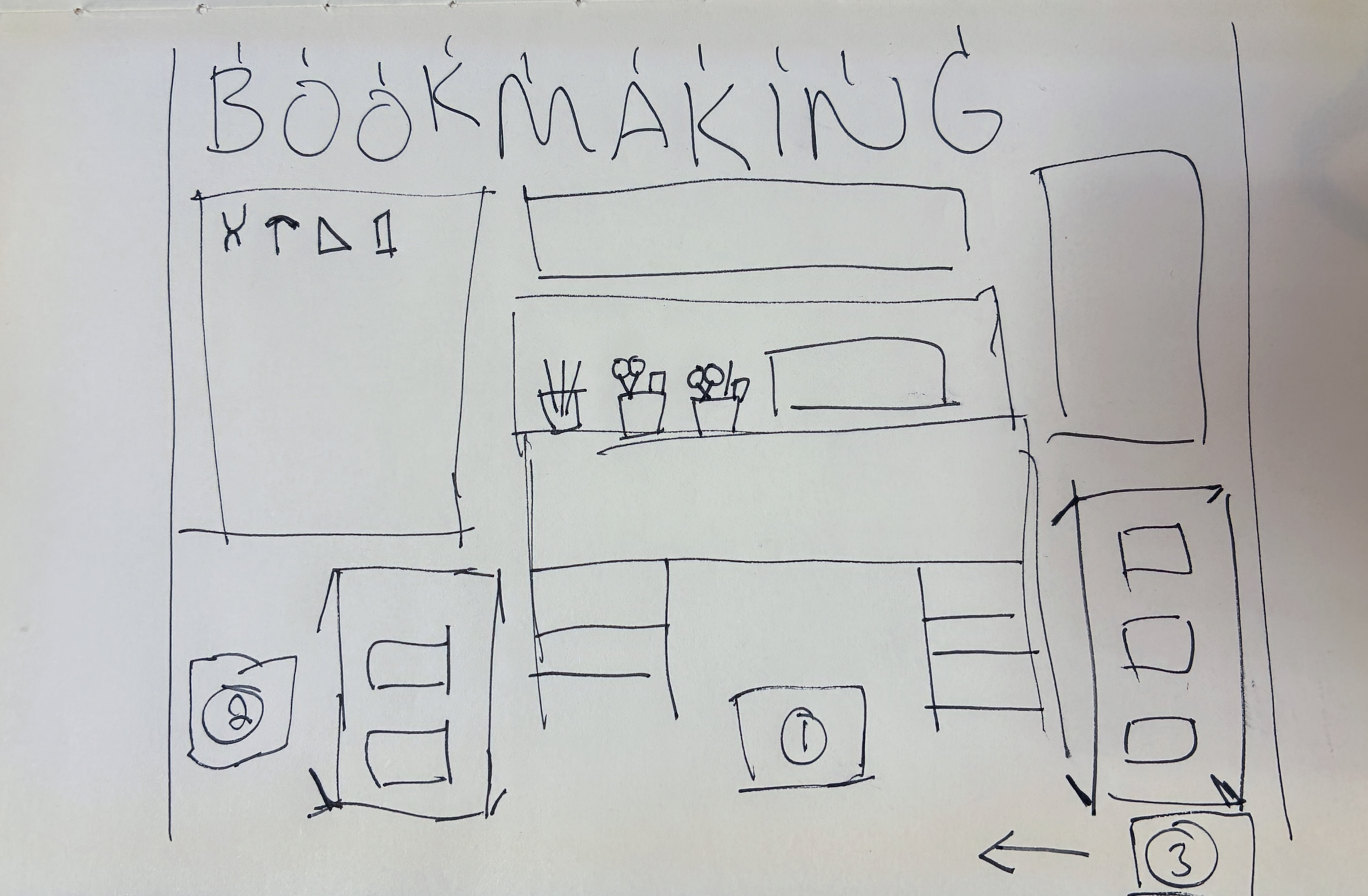
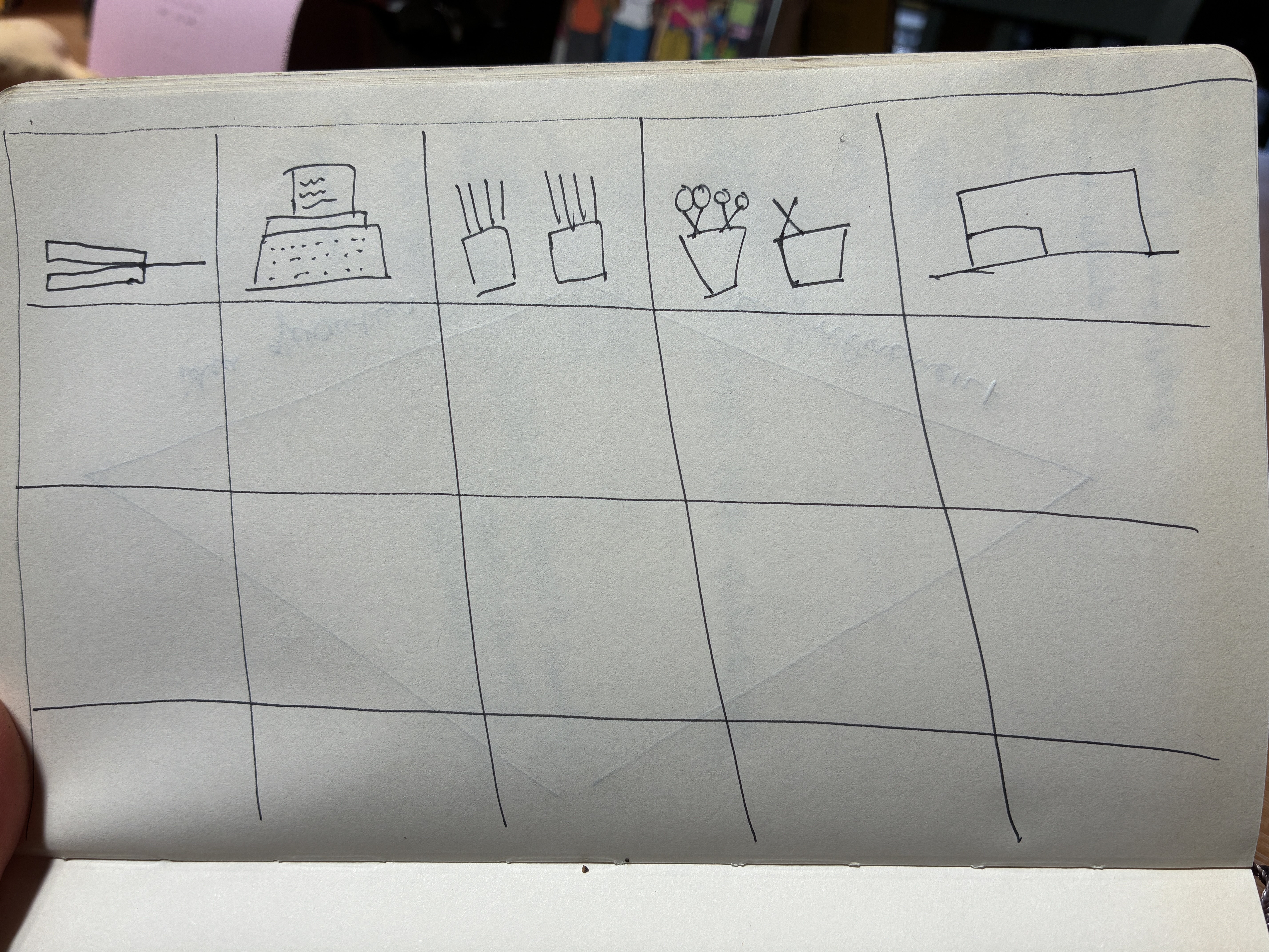
The second concept is an opposite extreme where the entire space is only dedicated to the singular display of tools needed in bookmaking. So there's a grid shelf (preferably each with a mini plexiglass lift-up drawer door) on each of the three walls, as can fit, and each square/rectangle only shows one kind of tool with its own fancy label. In a budget-free world, each would also have its own "museum light," think something along the lines of a Wes Anderson set in Moonrise Kingdom.
The second concept is an opposite extreme where the entire space is only dedicated to the singular display of tools needed in bookmaking. So there's a grid shelf (preferably each with a mini plexiglass lift-up drawer door) on each of the three walls, as can fit, and each square/rectangle only shows one kind of tool with its own fancy label. In a budget-free world, each would also have its own "museum light," think something along the lines of a Wes Anderson set in Moonrise Kingdom.
This was a fun little exercise for me but part of why I left arch school is that I don't love the nitty gritty of making these design concepts a reality.
Danish Dwelling
To design a dwelling space for students in a Danish dormitory, kollegium, I conducted interviews with young Danes to see what they valued most about their homes. I learned that spatial flexibility and natural lighting were high priorities for living in a Danish context and centered my design on these insights.


Research:
I started with a site analysis to understand context. The dwelling space itself was limited to 4 x 6 x 5 meters and located within the Aresanlo dormitory. One key part from this analysis was the dorm faced south, which maximized natural lighting, especially in the dark Danish winters.
I interviewed Tomas and Lina, a young couple, at their home in Copenhagen‘s Potato Row houses to learn more about what was important in living as a Dane. I wanted the cultural context to understand the needs and values of my intended inhabitants. I also wanted to know why they chose to live there, how they use the space in the house, and what they care most about in their home.


Findings:
Flexibility in spatial organization was a crucial factor. Tomas and Lina just entered the workforce and were looking for a place that would suit their young lifestyle while also accommodating their long-term plans. Their home provided an ideal solution: a central location in the city and spatial flexibility within.
The Potato Row houses have been around since the 1800s because they are easy to remodel. Tomas and Lina have already started adapting it to suit their own needs, like turning an extra bedroom into an office. They love this ability to easily remodel, especially since they want to eventually have children too.
The Potato Row houses have been around since the 1800s because they are easy to remodel. Tomas and Lina have already started adapting it to suit their own needs, like turning an extra bedroom into an office. They love this ability to easily remodel, especially since they want to eventually have children too.
Natural lighting was another priority. The love it and want as much as they can get throughout the house. They also gauge the amount of natural light each floor and room gets to determine how they use
the space. They tend to spend the most time on the top floor because it receives the most light.
I took these insights from Tomas and Lina and started brainstorming possibilities for the dwelling space. I played around with numerous ideas and concepts, including abstracting
features of a room and pushing them to the extreme.
Design
My talk with Tomas and Lina guided my design focus throughout my process. I chose to design for a theater student, and I refined my ideas to focus on the concept of flexibility, in order to give the student an opportunity to construct their own dwelling environment, much like they do on the stage.
By incorporating what I learned, I chose to focus on the two key areas I thought were important in a Danish context, and played the largest roles in determining the character of space created: lighting and spatial organization.

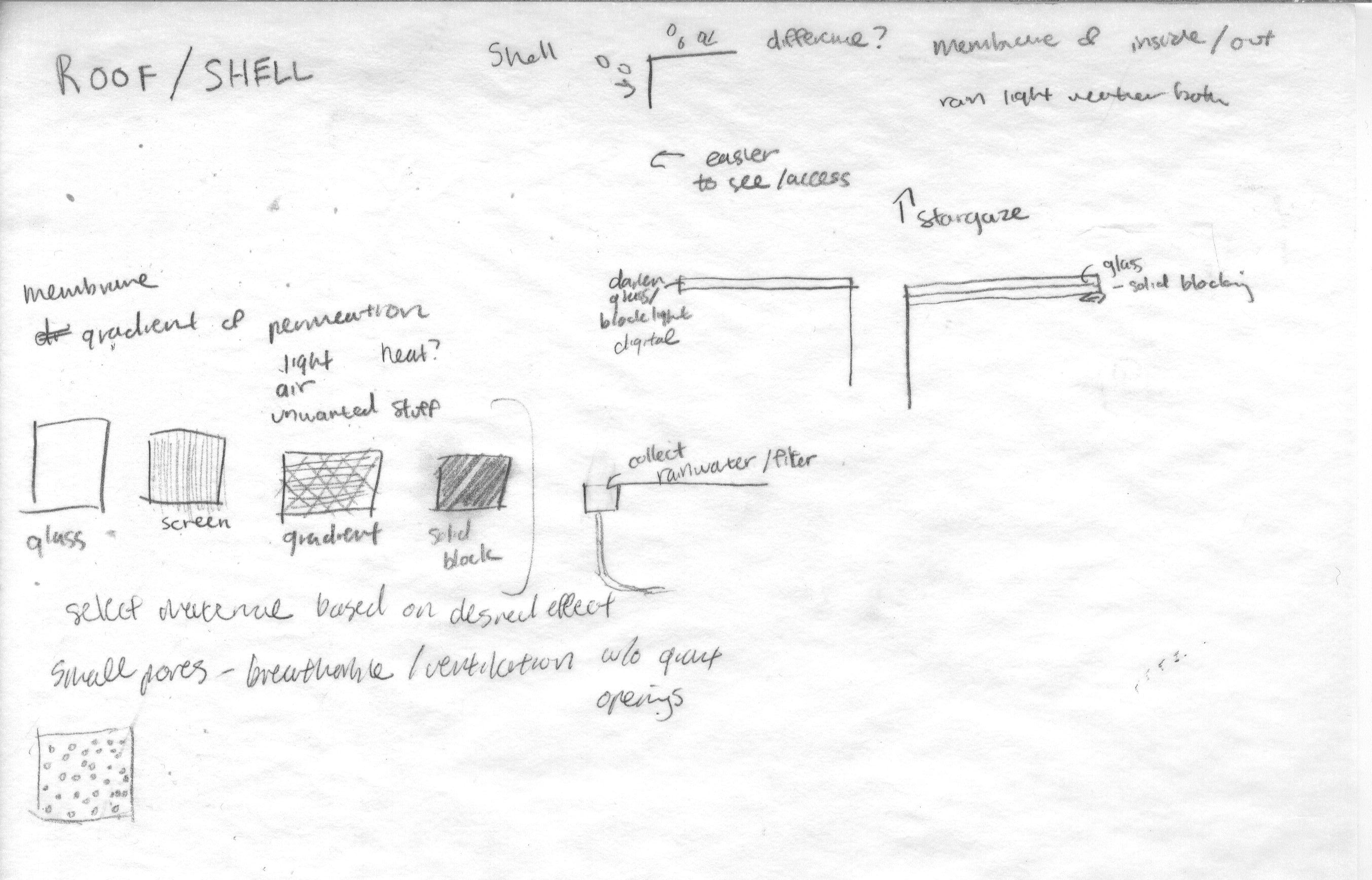
Lighting
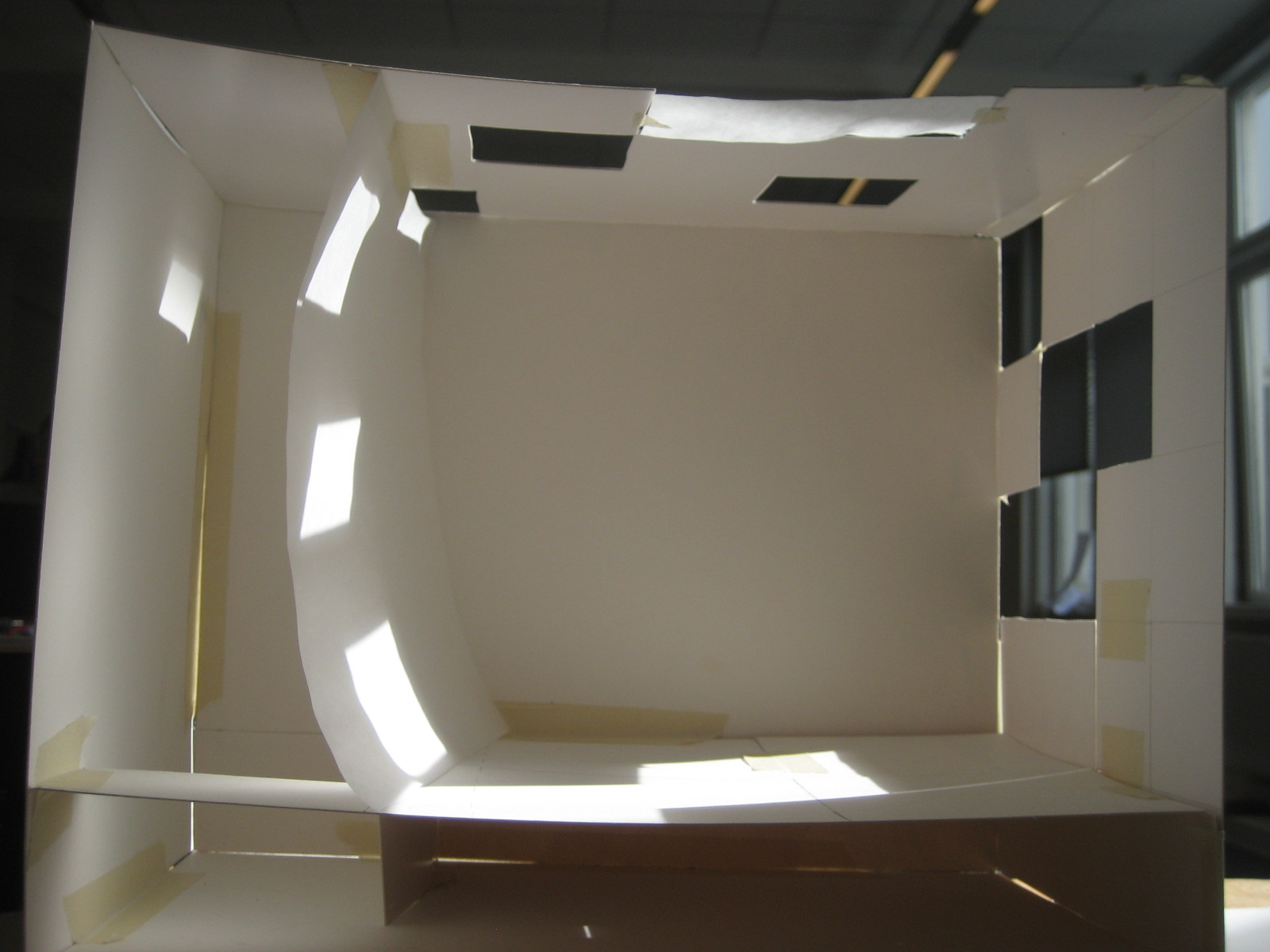
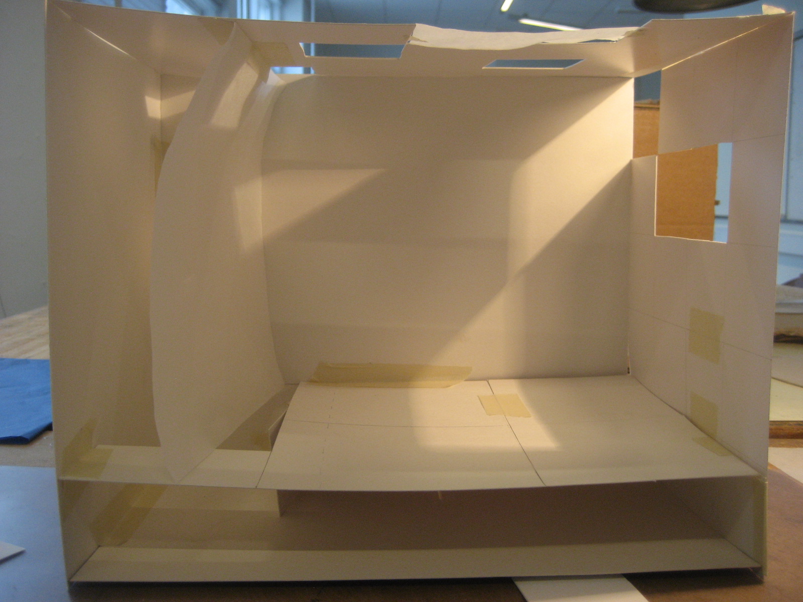
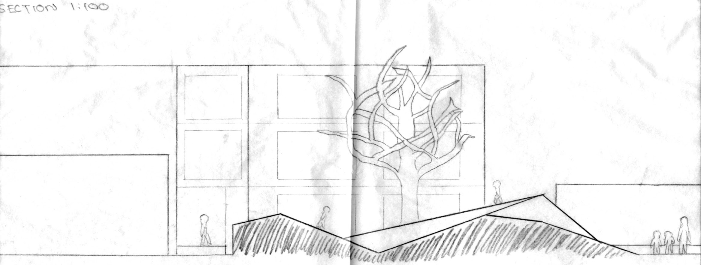
I designed a glass panel system on the outside wall and ceiling where each pane could transition from a gradient of completely clear, allowing all the light in, to completely dark, blocking it all out. The student could create combinations that formed different lighting patterns throughou the day depending on what they were in the mood for. I modeled a few of the many variations the room could get based on the season and time of day.
I designed a glass panel system on the outside wall and ceiling where each pane could transition from a gradient of completely clear, allowing all the light in, to completely dark, blocking it all out. The student could create combinations that formed different lighting patterns throughou the day depending on what they were in the mood for. I modeled a few of the many variations the room could get based on the season and time of day.
Spatial Organization
To achieve maximum openness and spatial flexibility, I created an interactive base to house the bathroom, sleeping, and storage functions that needed fixed locations.
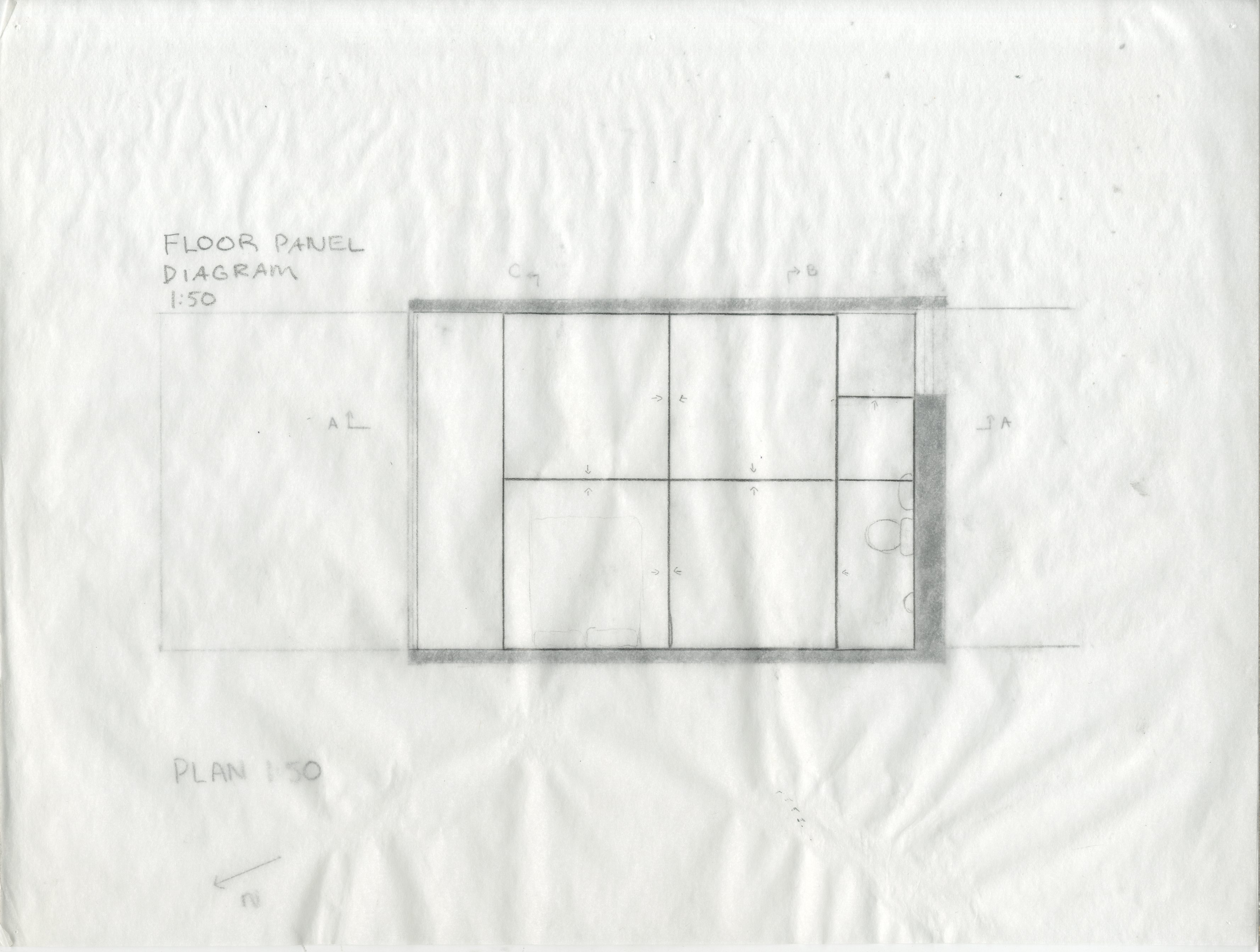
At the one-meter height level, I devised a floor panel system that that could cover the space below and complete a new floor above which creates another level of open space for the student to use.
To achieve maximum openness and spatial flexibility, I created an interactive base to house the bathroom, sleeping, and storage functions that needed fixed locations.
At the one-meter height level, I devised a floor panel system that that could cover the space below and complete a new floor above which creates another level of open space for the student to use.


If the student wanted to separate the space for different functions, I played with another aspect of the theater and incorporated curtains hanging from the ceiling in a modular grid. They can be arranged in a variety of combinations to form any compartments, almost like a bento box, that the student might want.
Overall, the student has plenty of flexibility and control with the dwelling, especially with lighting and spatial organization, and can easily tailor it to suit their needs, much like Tomas and Lina’s home.


Danish Play


This project involved exploring how children move and play within space and with various structural forms. We received prior approval to visit a preschool and observe how toddlers play. One of my main takeaways was how strongly culture can influence architecture. For example, the school had what I would describe as a large screenroom for the children to nap in, essentially sleeping outdoors.


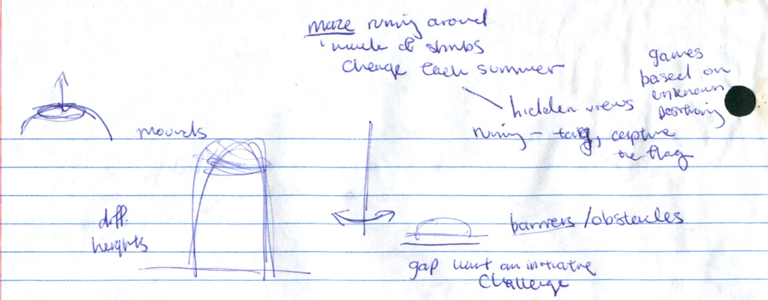

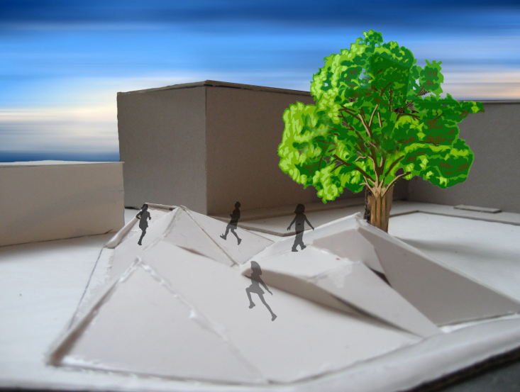
I started exploring the specific site of the playground we had to redesign. It was an irregular pentagonal shape, which somewhat limited what could be done. While the boundaries were fixed, the other dimensions could be played with. I explored elevation and incline as well as downward slope.

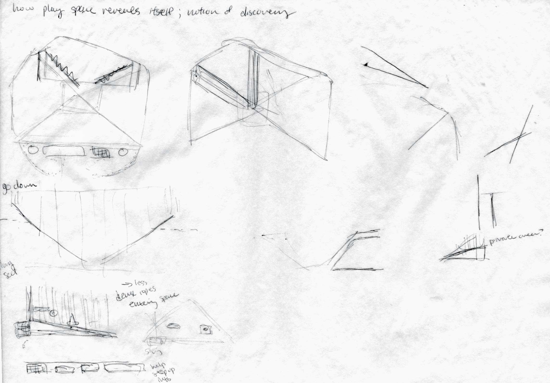
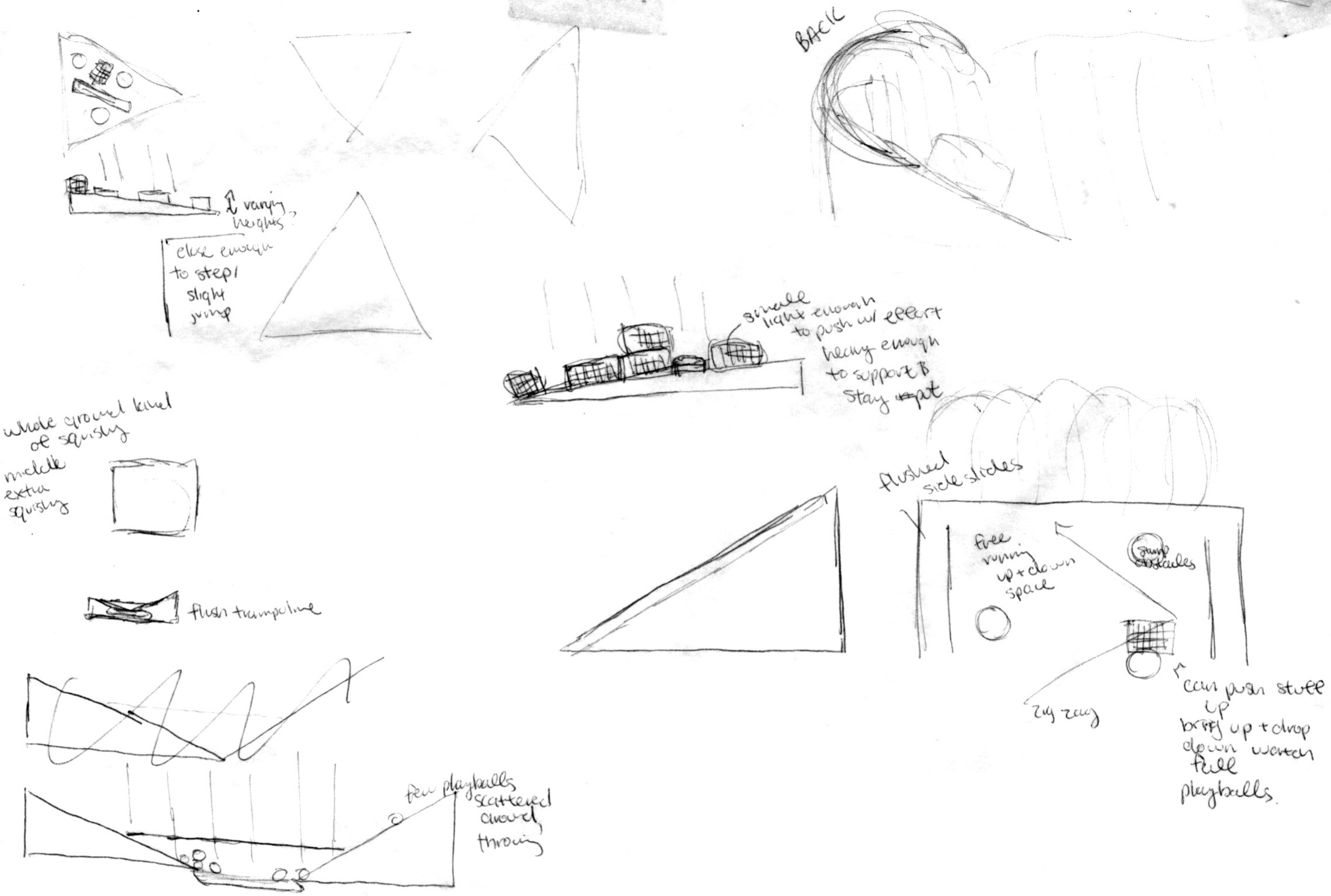
I struggled between cramming a variety of different playing structures I had researched and seen around Copenhagen versus keeping a minimal, abstract structure that could convey variety, while still teaching through motion and engagement.

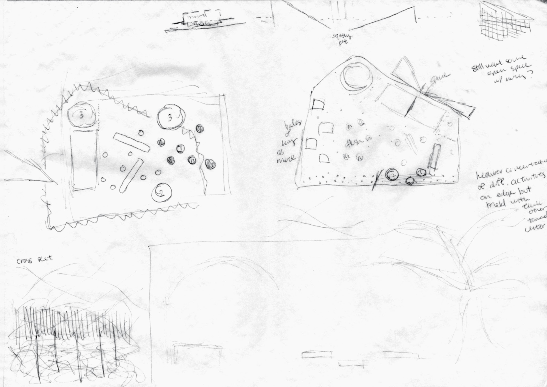
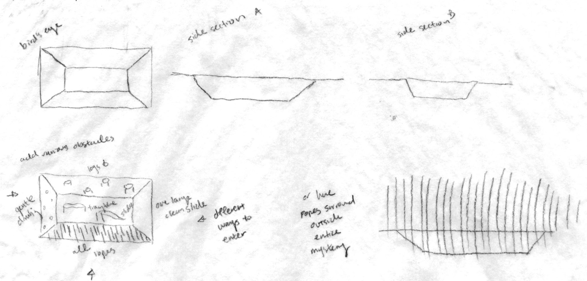
I went with the latter since I think doing more with less is more fun.

I used a landscape approach because I thought it encouraged movement in children more by inviting and enticing them to roam freely--with an open space compared to a traditional building structure. It’s also easily accessible both visually and physically, and blends seamlessly with the existing outdoor play area.
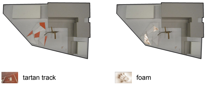
I used a series of upward and downward, differently angled ramps and materials to form a running gym. The various combinations create new physical encounters and demand adaptation to the common movement children know so well. It creates a space that encourages movement while teaching the differences of angles and surface materials.